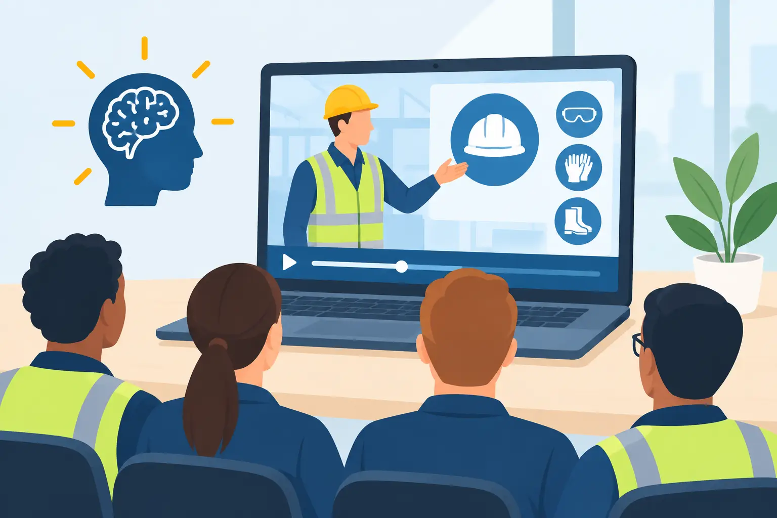
Category: People Pulse Media

  • Video Onboarding With Assessments That Proves Learning

    Video Onboarding With Assessments That Proves Learning

    A completed video is not proof that an employee understands the job. In safety-sensitive operations, that gap can become an incident, a failed audit, or a supervisor repeating the same instructions on every shift. Video onboarding with assessments closes the gap by connecting clear training content to a verified result: who watched, what they understood, where they need support, and when they were approved to begin work.

    For HR, HSE, operations, and compliance leaders, this is not a content upgrade. It is a control point. The video explains the standard. The assessment confirms comprehension. The record shows the organization took reasonable, documented steps to prepare the worker.

    Why completion rates are not enough

    Traditional onboarding often measures attendance. An employee signs a paper sheet, joins a briefing, or reaches the end of a long video. Each action can show participation. None can reliably show understanding.

    That distinction matters most when work involves site access, machinery, hazardous materials, food handling, patient care, driving, or customer-facing procedures. A worker may know they watched a module without knowing which PPE is required, who can authorize a permit, or what to do when a condition changes.

    Long presentations make the problem worse. People retain less when procedures, policies, and warnings are delivered in one dense session. A mixed-language workforce adds another layer of risk. If the message is technically correct but difficult to follow, the training has not done its job.

    Video onboarding with assessments creates a more useful standard. It asks a practical question: can this person demonstrate the knowledge required for this role before moving forward? The answer is documented rather than assumed.

    What effective video onboarding with assessments includes

    The best programs are built around the worker’s first days, first tasks, and first risks. They do not attempt to turn every policy into a film. They focus attention on the decisions that matter on the floor, at the site, in the vehicle, or in front of the customer.

    A strong onboarding sequence usually begins with a short orientation video that introduces the workplace, expected behaviors, reporting lines, emergency actions, and non-negotiable safety rules. Role-based modules then address the specific hazards and procedures relevant to the employee’s work. A warehouse picker, maintenance technician, sales representative, and contractor should not all receive the same generic training path.

    Assessment design is equally important. Questions should test application, not memory tricks. Instead of asking whether an employee remembers the title of a policy, show a realistic situation. What should happen if a spill is found near a loading area? Which step comes before operating a piece of equipment? Who must be notified after a near miss?

    The assessment should also have a defined pass mark, a retry route, and a clear escalation process for repeated failure. A low score is not simply a compliance exception. It can identify unclear content, language barriers, weak supervision, or a worker who needs direct coaching before being assigned higher-risk tasks.

    The content must work on the first viewing

    Safety has to be understood the first time. That requires more than good-looking footage.

    Effective training videos use plain language, visible demonstrations, relevant locations, and a pace that respects the audience. They show the correct behavior instead of describing it abstractly. They avoid overloaded screens, extended corporate messaging, and scenes that have no relationship to the employee’s actual work.

    For multilingual teams, translation must preserve meaning, not just replace words. Arabic, English, Hindi, Malayalam, and other language versions should reflect the terminology workers recognize on site. Captions, voiceovers, and visual cues can reinforce comprehension, but they do not replace a properly localized script.

    A five-minute module that answers one clear operational question is often more valuable than a 30-minute induction video that tries to cover everything. Shorter content is not automatically better, however. If a critical procedure needs a full demonstration, compressing it for the sake of completion data creates its own risk. The right length is the length needed for clear understanding.

    Build the assessment around real decisions

    An assessment should feel connected to the video, the role, and the environment. Employees quickly disengage when questions are generic, overly academic, or unrelated to how work is actually performed.

    Use scenarios that mirror the decisions employees will face. For example, a construction induction may test exclusion zones, lifting signals, heat-stress reporting, and permit boundaries. A manufacturing module may focus on lockout procedures, machine guarding, hygiene, and reporting a defect. A healthcare onboarding program may cover patient privacy, infection control, and escalation paths.

    Question format should match the risk. Multiple-choice questions work well for confirming key rules and recognizing unsafe conditions. Image-based questions can test whether workers can spot a hazard. Sequenced questions can confirm the order of a procedure. For higher-risk jobs, digital assessment should support, not replace, a practical observation by a competent supervisor.

    That last point matters. A passed quiz does not prove someone can safely operate complex equipment or complete a specialized task. It proves a defined level of knowledge. Organizations should combine digital results with field verification where the role requires it.

    Make records useful when an audit arrives

    Paper records create avoidable problems. Forms go missing. Signatures are unclear. Training matrices become outdated. When an audit, incident review, or client request arrives, teams spend hours assembling proof from folders, email threads, and spreadsheets.

    A device-accessible onboarding platform changes that workflow. Each employee can receive the required learning path, complete videos and assessments, and generate a dated record linked to their role. Supervisors and administrators can see completion status, scores, retries, overdue modules, and gaps by team or location.

    This is where the system becomes operationally valuable. The training video teaches. The platform proves training is understood.

    With PULSYON, organizations can assign role-based video modules and live assessments without sending every employee into a classroom or relying on paper forms. No classroom. No paperwork. Nothing to install. The outcome is a clearer trail from assigned training to assessed understanding.

    The record should be easy to retrieve, but data quality matters more than dashboard volume. Collect the information that supports compliance and management action: employee identity, assigned module, version completed, completion date, score, attempts, acknowledgment, and any required supervisor signoff. If a policy changes, the system should make it clear which employees completed the revised version and which have not.

    A practical rollout approach

    Start with one high-priority onboarding journey rather than trying to digitize every training document at once. Choose a process with visible risk, repeated administrative effort, or recurring gaps in understanding. New-hire site induction, contractor orientation, and equipment-specific refresher training are common starting points.

    First, define what a worker must know before beginning the role. Keep this focused. Then review existing content for accuracy, language suitability, and relevance to actual work conditions. Old slide decks often contain too much policy language and too little usable instruction.

    Next, produce concise video modules and write assessments before finalizing production. This keeps the training and the test aligned. If a question cannot be answered from the module, either the question is wrong or the video needs to explain the point more clearly.

    Pilot the program with a representative group. Include new hires, experienced workers, supervisors, and speakers of the relevant languages. Watch where people pause, fail, ask for help, or misinterpret a question. These moments are evidence. Use them to improve the training before a wider rollout.

    Finally, agree on ownership. HR may manage onboarding assignments, HSE may approve safety content, operations may verify role readiness, and compliance may need reporting access. The process works best when responsibilities are clear from the beginning rather than added after launch.

    Measure understanding, not just activity

    Completion rate is useful, but it is only the first measure. Look at pass rates by role, location, language, and module. Review common wrong answers. Track how long completion takes and whether workers repeatedly need retries. Compare results with supervisor observations, near-miss trends, and induction-related questions from the field.

    Do not treat lower scores as a reason to make assessments easier. First ask whether the training is clear enough, whether the translation fits the workforce, and whether the scenario reflects the real task. A well-designed assessment can expose a communication problem before it becomes an operational problem.

    The goal is not to create more training administration. It is to give employees the information they need in a form they can understand, then give managers evidence they can act on. Begin with the role where misunderstanding carries the highest cost, and build outward from there.
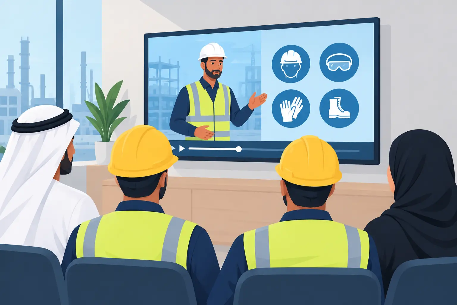

  • Arabic Workplace Safety Videos Workers Understand

    Arabic Workplace Safety Videos Workers Understand

    A worker is about to enter a confined space. The permit is ready. The supervisor has explained the controls. But the worker has only half understood the training video because it was delivered in a language that is not his strongest.

    That is not a content problem. It is an operational risk. Arabic workplace safety videos help organizations communicate critical procedures in a language workers, supervisors, visitors, and local stakeholders can understand from the first viewing. When the message concerns lockout/tagout, PPE, vehicle movement, chemical handling, or emergency response, clarity is not a nice extra. It is part of the control.

    Why Arabic workplace safety videos matter in Gulf operations

    Across the UAE and wider Gulf region, many sites operate with multilingual teams. English is often the working language for procedures and documentation, while Arabic may be required for local employees, government-facing communication, site visitors, and client expectations. A single English-only safety video can leave gaps, even where the workforce has basic English proficiency.

    Safety language is also different from conversational language. A worker may understand “wear your helmet” but miss the meaning of an exclusion zone, a permit condition, or a sequence for isolating energy. Under pressure, people do not have time to translate technical instructions in their heads. They need to recognize the hazard, understand the action, and know what to do if something changes.

    Arabic video gives organizations a direct way to close that gap. It can explain the same approved procedure with Arabic narration, Arabic on-screen text, and visual demonstrations that make the instruction easier to retain. For many businesses, this is not about replacing English. It is about making the required message accessible in both languages without creating two different standards.

    Translation is not enough

    A safety script can be translated accurately and still fail as training. Literal wording, formal language, and dense on-screen text can turn an otherwise sound production into something workers watch without absorbing.

    The better approach starts with the task itself. What does the worker need to notice? What action must happen before work begins? What is the one behavior that prevents the incident? Those questions should shape the script before recording Arabic narration.

    For example, a video about forklift safety should not spend most of its running time defining terms. It should show the operator checking the vehicle, wearing the seat belt, observing speed limits, keeping forks low, stopping at blind corners, and separating pedestrians from moving equipment. Arabic narration should reinforce what appears on screen, not compete with it.

    There is also a language decision to make. Modern Standard Arabic is generally appropriate for formal workplace training, particularly when the content is used across multiple Gulf markets. However, terminology should be reviewed by people who understand the sector and the audience. The wording used in a construction induction may differ from the language needed for a hospital, factory floor, or automotive workshop.

    Build the video around the moment of risk

    Long presentations are easy to commission and hard to use. They tend to combine every policy, every rule, and every exception into one recording that workers cannot recall on site. Safety has to be understood the first time, so the most effective videos are usually focused on a defined work activity or hazard.

    A practical production process begins with the approved procedure, risk assessment, and site rules. Then it identifies the points where misunderstanding has real consequences. That might be the moment before a worker enters a restricted area, lifts a load, starts a machine, or responds to a spill.

    Three things should be clear in every scene: the hazard, the required control, and the expected behavior. Done properly, this keeps the training direct without oversimplifying it.

    Visual proof matters. If workers must inspect a harness, show the inspection. If they must establish a barricade, show the correct boundary. If they must report an unsafe condition, show who receives the report and what information is needed. Real locations and real work environments can make a message more credible, while animation can be the better choice for hazards that cannot safely be filmed or for processes that need a clean, consistent explanation.

    Design for workers, not for a boardroom screen

    A polished corporate film and an effective safety training video are not the same thing. Production quality still matters because poor sound, unclear graphics, or weak subtitles reduce attention and trust. But the purpose is comprehension, not decoration.

    For frontline audiences, use plain language, short scenes, strong visual contrast, and a steady pace. Avoid placing key instructions only in small text. Avoid showing a worker doing something incorrectly without making the correction obvious. And avoid background music that competes with the Arabic voiceover.

    Subtitles are useful, particularly in noisy environments or where a worker is more comfortable reading one language while listening to another. They are not a substitute for clear narration and visuals. The best combination depends on the workforce. A site with Arabic and English speakers may need both subtitle tracks. A broader induction may need Arabic, English, Hindi, and Malayalam versions from the same master production.

    Consistency matters here. Each version must preserve the same safety standard, sequence, and approval status. Creating separate videos without a controlled master script can introduce subtle contradictions between languages.

    Make understanding measurable

    A completed video is not proof that training has worked. A worker can press play, leave the device unattended, or finish the video without understanding a critical instruction. For audits, incident investigations, and operational confidence, organizations need more than a viewing record.

    A short assessment after the video can test the points that matter most. It should not be a vague memory test. It should confirm whether the learner knows the correct action in a real situation: which PPE is required, what to check before operating equipment, where to report a hazard, or when work must stop.

    This is where role-based delivery becomes useful. A warehouse picker, a maintenance technician, and a site visitor do not need the same content or the same level of assessment. Assigning relevant Arabic safety modules by role keeps training time focused and prevents a general induction from becoming a long, forgettable session.

    People Pulse Media uses PULSYON to make this process device-accessible and documented. The video trains. The assessment records whether the worker understood. Completion data, scores, and training records give HSE, HR, and compliance teams evidence they can retrieve when it is needed.

    Where Arabic video delivers the most value

    The strongest use cases are usually the ones where a missed instruction can immediately affect people, equipment, or compliance. Construction teams may need Arabic induction and work-at-height modules. Manufacturing operations may need machine guarding, chemical safety, and emergency response content. Healthcare and FMCG environments often need hygiene, infection control, and safe manual-handling training.

    Arabic safety video also has value beyond the shop floor. It can support contractor onboarding, visitor orientation, driver safety, code-of-conduct communication, and incident-prevention campaigns. In each case, the format should match the job. A two-minute pre-task reminder serves a different purpose from a full onboarding module.

    There is a trade-off. Shorter videos improve attention and make updates easier, but they cannot carry every detail in a complex procedure. Use video to explain the behavior and the reason behind it. Keep controlled documents, permits, toolbox talks, and supervisor briefings for the depth that certain high-risk work requires.

    Start with one high-risk message

    Organizations do not need to rebuild their entire training library at once. Start with a safety message that is frequently misunderstood, regularly repeated, or connected to a known incident trend. Review the existing procedure, identify what workers are missing, and produce one Arabic version that demonstrates the correct behavior clearly.

    Then measure more than completions. Ask supervisors whether behavior is improving. Track common assessment errors. Review whether the content reduces repeat explanations during onboarding or toolbox talks. Update the video when equipment, layouts, or procedures change.

    The best Arabic workplace safety videos do not make safety communication look better. They make the next safe action easier to understand and harder to miss.

  • 3D Animation Services That Make Training Clear

    3D Animation Services That Make Training Clear

    A lockout procedure can look straightforward in a written manual and still be misunderstood beside an active machine. A confined-space entry sequence can be covered in a classroom and forgotten before the next shift. 3D animation services solve this gap by showing people exactly what happens, in the right order, before the work begins.

    For organizations operating across construction, manufacturing, healthcare, logistics, automotive, and other safety-sensitive sectors, animation is not decoration. It is a controlled way to explain risk, process, equipment, and behavior when filming is difficult, unsafe, expensive, or simply too limited.

    Why 3D works when live footage cannot

    Some subjects are hard to film well. The equipment may be unavailable. The process may only occur during shutdowns. Recording inside a hazardous zone may create unnecessary risk. Or the most important part of the story may be invisible: a gas release, an electrical arc, a pressure change, a product flow, or the consequence of skipping one control step.

    3D animation makes those details visible. It can isolate the exact component a worker must inspect, cut through machinery to show internal movement, slow down a critical action, and show a safe outcome alongside an unsafe one. This gives teams a clearer mental model before they encounter the real environment.

    That matters because frontline communication has a narrow window. People may be watching before a shift, on a mobile device, or during onboarding with limited time. A well-planned animation reduces explanation to what people need to see, hear, and remember. No unnecessary scenes. No generic stock footage that looks like every other safety video.

    What effective 3D animation services should deliver

    A polished render is not automatically a useful training asset. For operational communication, the work must be accurate first, then clear, then visually credible. Those priorities shape every decision, from scriptwriting through final delivery.

    Process accuracy before visual effects

    The animation needs to reflect how work is actually done. That means checking the sequence with HSE, operations, maintenance, quality, or engineering teams before modeling begins. PPE must be correct. Access routes must make sense. Controls, labels, isolations, and equipment positions must reflect the real site or approved procedure.

    This review stage prevents a common and costly problem: a beautiful video that teaches the wrong action. It also gives subject-matter experts a structured way to validate the content before it reaches the workforce.

    Clear storytelling for the intended role

    A technician, a contractor, a supervisor, and a visitor do not need the same level of detail. Good animation identifies the viewer and builds around the decisions that person will make.

    For a contractor induction, the message may focus on site access, pedestrian segregation, alarm response, and prohibited behavior. For a maintenance team, it may need to show isolation points, verification steps, and stored-energy hazards. For a sales or corporate audience, the same 3D capability can explain a complex product, facility, or service without turning the presentation into an engineering lecture.

    The difference is strategic. One animation can look impressive and still fail if it tries to serve every audience at once.

    Language that supports understanding

    Visual communication travels well across multilingual teams, but visuals alone are not enough. Voiceover, on-screen text, labeling, and subtitles should be developed for the languages people use on site. Arabic, English, Hindi, Malayalam, and other required languages must remain concise and natural, not feel like a direct translation added at the end.

    The goal is not simply to produce multiple versions. It is to make the instruction understandable on the first viewing. That improves recall, reduces supervisor re-explanation, and gives organizations a more defensible approach to workforce communication.

    Where 3D animation creates practical value

    3D is particularly useful when a real-world demonstration would interrupt operations, expose people to risk, or fail to show the full picture. In the Gulf region, where large workforces, complex sites, and tight project schedules are common, those conditions appear often.

    Safety training is one of the strongest use cases. Organizations use animation to explain working at height, lifting operations, fire response, traffic management, electrical safety, chemical handling, emergency evacuation, and permit-to-work requirements. A sequence can show the correct behavior in a matter of seconds, then reinforce the consequence of ignoring it without putting a person in harm’s way.

    It is also valuable for technical and operational training. Equipment assembly, preventive maintenance, product handling, quality checks, warehouse flow, and service procedures can be demonstrated consistently across sites. That consistency is useful when trainers change, teams are distributed, or the same process must be repeated for hundreds of new hires.

    Outside workforce training, 3D helps organizations explain facilities, products, and systems that are not easy to photograph. A manufacturer can show an internal product feature. A developer can communicate a planned facility before construction is complete. An insurance or healthcare organization can simplify a service process that would otherwise need pages of explanation.

    Three things. Accurate process. Clear message. Appropriate format. Done properly, the asset supports safety, operations, and commercial communication without blurring their objectives.

    The trade-offs to consider before commissioning animation

    3D animation is powerful, but it is not always the right answer. If the main requirement is to show an employee greeting a customer or completing a simple office task, live action may feel more natural and cost less. If a process changes every few weeks, a modular motion-graphics approach may be easier to update than a detailed 3D environment.

    The level of realism also depends on the objective. A high-detail digital twin of a production line can be valuable for technical instruction, but it takes more reference material, review time, and budget. A simplified model may explain the essential safety action more effectively, especially for a short induction video.

    The key question is not, “Should this look cinematic?” It is, “What must the viewer understand and do afterward?” That question protects the budget and keeps the production focused.

    A disciplined production process prevents rework

    The strongest projects begin before any modeling or rendering. First, the production team defines the business outcome: safer behavior, faster onboarding, consistent product explanation, reduced incidents, or clearer stakeholder communication. The script then turns that outcome into a sequence of practical messages.

    Next comes visual planning. Storyboards establish what will be shown, the camera angle, the pace, the labels, and the moments where attention needs to slow down. This is where internal reviewers can challenge accuracy without waiting for a finished video.

    Once the storyboard is approved, artists build the environments, machinery, characters, and safety elements. Animation, voiceover, sound, text, and language versions follow. Review points should be limited but meaningful. Too many unstructured opinions can delay delivery and weaken clarity, while too little operational review creates compliance risk.

    Final delivery should fit the way the organization will use the content. A widescreen version may suit a training room or corporate presentation. Vertical or square edits can support internal mobile communication. Short cutdowns can reinforce one behavior during toolbox talks. When training completion must be documented, the video can sit inside a role-based assessment workflow so managers can see who watched, completed, and demonstrated understanding.

    People Pulse Media approaches this as an operational communication task, not a visual-effects exercise. The video trains. A documented assessment process can prove that training was understood.

    How to judge whether the animation worked

    Views alone are a weak measure. A mandatory video can receive full completion rates and still leave people unsure about the action they need to take. Better measures depend on the goal.

    For safety communication, look at assessment results, recurring supervisor questions, observed behavior, incident trends, and time required for induction. For technical training, consider error rates, time to competency, maintenance quality, and the consistency of task execution. For commercial animation, measure whether sales teams use it, whether prospects understand the offer faster, and whether it improves qualified conversations.

    Feedback from the people doing the work is especially useful. If a new employee can describe the key hazard and correct response after one viewing, the animation is doing its job. If supervisors still need to decode it, the message needs work, regardless of how polished it appears.

    Start with the moment that matters

    The best 3D animation does not try to show everything. It identifies the moment where misunderstanding creates risk, delay, cost, or lost confidence, then makes the right action easy to see.

    That is the standard worth holding. When people can recognize the hazard, follow the process, and explain the decision back in their own words, the animation has become more than content. It has become useful work.

  • Conversion Focused Website Design That Works

    Conversion Focused Website Design That Works

    A B2B website can look polished, load quickly, and still fail at the one job that matters: moving the right visitor toward a real business conversation. Conversion focused website design fixes that gap. It gives decision-makers a clear reason to trust you, understand what you do, and take the next practical step.

    For organizations in construction, manufacturing, healthcare, insurance, FMCG, and other operationally demanding sectors, this is not about chasing clicks. A strong website has to explain complex services without making buyers work for the answer. It has to reassure procurement teams, operations leaders, HSE managers, and marketing teams that they are dealing with a capable partner.

    A website is part of the sales process

    Many company websites are built as digital brochures. They list services, show a few project images, add a contact form, and hope visitors connect the dots. That approach breaks down when the offering is technical, the buying cycle is long, or multiple stakeholders need to approve a supplier.

    A conversion-focused site is designed around the questions buyers actually ask. What problem do you solve? Have you worked in an environment like ours? Can you deliver at the required scale and timeline? What happens after we make contact?

    The answers should not be buried under vague claims or long blocks of company history. Buyers need clarity early. They need evidence soon after. Then they need a low-friction way to start a conversation.

    This does not mean every visitor should be pushed toward a hard sell. A visitor looking for multilingual safety-training video production may need a different path from a marketing director reviewing brand identity work. Conversion is not one button repeated across every page. It is the deliberate design of useful next steps for different buying situations.

    Start with the commercial problem, not the homepage layout

    The common starting point is, “What should the homepage look like?” The more useful question is, “What must this website help the business achieve?”

    That might mean generating better-qualified inquiries, reducing time spent explaining services on introductory calls, supporting a sales team with credible proof, or making a complex offer easier for regional stakeholders to evaluate. These goals affect content, page structure, calls to action, and the information requested on a form.

    For example, an HSE leader may arrive with an immediate problem: training content is too long, comprehension is inconsistent across languages, and audit evidence is difficult to produce. The website should state that problem plainly, show the operational outcome, and explain the delivery model. A generic statement about “creative excellence” does none of that work.

    Before design begins, define three things properly: the priority audience, the action you want them to take, and the proof they require before acting. This creates a site with commercial direction rather than visual decoration.

    Make the offer understandable in seconds

    Senior buyers are busy. They may be reviewing your company between meetings, on a phone, or while comparing several suppliers. They should not need to interpret your terminology to understand your value.

    The opening section of a page should identify the service, who it is for, and the result it supports. Plain language is usually stronger than inflated language. “Multilingual safety videos that frontline teams understand the first time” is more useful than a broad promise about transformational content.

    This is especially relevant in safety-sensitive sectors. If a company produces compliance video, onboarding systems, 3D animation, or complex digital services, the website should translate the offer into an operational benefit. Better understanding. Faster onboarding. Consistent messaging. Documented completion. Fewer gaps between policy and practice.

    Clarity also means knowing what to leave out. A large service menu can create doubt if every capability is presented with equal weight. Lead with the work that solves the buyer’s most expensive or urgent problem. Supporting services can follow once the main reason to engage is clear.

    Build trust before asking for the inquiry

    B2B decisions rarely happen because a visitor likes a headline. They happen when confidence builds across the page. Design contributes to that confidence, but it cannot carry it alone.

    Relevant proof gives claims weight. This can include sector experience, project examples, process detail, testimonials, language capability, delivery standards, or measurable outcomes. If you serve organizations across the Gulf, show that you understand the realities of regional workforces, approval processes, and multilingual communication.

    Proof should sit close to the claim it supports. If you say training is designed for frontline comprehension, explain how: concise scripts, clear visuals, familiar scenarios, and versions in Arabic, English, Hindi, Malayalam, or other required languages. If you say an onboarding platform creates audit-ready records, state what is recorded and who can access it.

    Specificity is persuasive because it reduces perceived risk. It tells buyers that the team has considered the details that can derail a project after the contract is signed.

    Credibility signals that matter

    The strongest signals are usually practical rather than flashy:

    • Relevant experience in the buyer’s sector or operating environment
    • A clear delivery process with defined review and approval stages
    • Work samples that show the standard of thinking and production
    • Outcomes that can be understood without exaggerated promises
    • A direct route to senior people who will remain involved after the proposal

    Not every business has dramatic performance data to publish. That is fine. Honest detail about how you work is often more convincing than numbers without context.

    Design the page around decision paths

    A useful page does not force every visitor through the same route. Some people are ready to request a proposal. Others need to see examples, understand the process, or share the page with a colleague before they act.

    That is why calls to action should reflect intent. A high-intent service page may lead with “Discuss your project” or “Request a proposal.” A visitor who is still evaluating may respond better to “View our work” or “See how the process works.” Both actions can support conversion because both reduce the chance that a capable prospect leaves without moving forward.

    Navigation matters here as well. Keep the main menu disciplined. Visitors should be able to find priority services, relevant work, sector expertise, and a contact route without opening a maze of dropdowns. A website is not improved by making every internal department visible.

    Mobile experience deserves the same attention. In Gulf B2B markets, stakeholders frequently review websites from phones before forwarding them internally. Large visual files, unreadable text, hidden calls to action, and forms that demand too much information create unnecessary abandonment.

    Remove friction from the contact step

    A contact form is not an administrative hurdle. It is the handoff between marketing and sales. It should collect enough information to make the first conversation useful, but not so much that the visitor postpones it.

    For many service businesses, name, company, email, phone number, and a short project brief are enough. If qualification is essential, add one or two relevant fields, such as service required or expected timeline. Asking for a full procurement specification before the first response can work against you.

    Set expectations after submission. Let people know that their inquiry has been received and what will happen next. If your business responds within a defined timeframe, say so only if the team can consistently meet it. Reliability is built through small moments as much as large project deliveries.

    The contact route should also be easy to find on every key page. If a visitor has read a detailed case study or service explanation, they should not need to return to the homepage to start a conversation.

    Measure more than form submissions

    A website that generates ten inquiries is not automatically performing better than one that generates four. The quality of those inquiries, the sectors they come from, their progression into opportunities, and the revenue they influence all matter.

    Track the pages that bring visitors into the site, the service pages they continue to, the actions they take, and where they leave. Review this alongside feedback from sales and account teams. If prospects repeatedly ask a question that the website should have answered, that is a content problem. If strong prospects reach the contact page but do not submit, examine the form and the offer around it.

    Conversion improvement is an ongoing operational task. It may involve rewriting one service page, adding clearer proof, reducing form fields, improving page speed, or giving a specific audience its own landing page. Small changes can have a meaningful effect when they remove a real point of hesitation.

    Conversion focused website design needs discipline

    The best websites do not try to say everything. They decide what matters most to the right buyer and make it easy to understand. They combine clear messages, relevant evidence, purposeful design, and a contact path that respects the visitor’s time.

    People Pulse Media approaches web work this way because a website should support business performance, not simply satisfy a launch checklist. The design has to look credible. The content has to make sense. The journey has to lead somewhere useful.

    When your website reflects how buyers make decisions, it becomes more than a corporate presence. It becomes a dependable part of the work that turns attention into qualified opportunity.

  • B2B Website Design Agency for Complex Sales

    B2B Website Design Agency for Complex Sales

    The Website Test Most Agencies Would Fail On Their Own Site

    A buyer lands on your site from a search. She is between meetings, on her phone, with about ninety seconds before the next call.

    She is not reading your vision statement. She is checking three things. Do these people do the thing I need. Have they done it for someone like me. Who do I contact.

    If she cannot answer all three quickly, she leaves and tries the next result. No hard feelings. She just has a shortlist to build by Thursday.

    We are rebuilding our own website at the moment, which is a humbling exercise for an agency.

    Ours looked good. Clean design, decent photography, everything a client would approve. It also generated almost nothing. No enquiries worth the name.

    That is an uncomfortable thing to discover about your own shop window. It is also the reason I now ask a different first question when someone shows me their site. Not how does it look. What has it actually produced.

    Why B2B websites fail before anyone calls you

    Rarely the colours.

    Most fail because they were built around the company’s internal structure. Departments become menu items. Service names come from how the team talks internally, not how a buyer searches. A visual trend gets applied over the top and everyone signs it off because it looks current.

    Meanwhile the people actually arriving have very different questions.

    Three visitors, three anxieties

    A procurement manager wants proof you can deliver at the scale stated.

    An HSE (Health, Safety and Environment) lead wants to know whether your training content survives a workforce speaking four languages.

    A marketing director is checking whether you can hold a brand system together across twenty touchpoints without supervision.

    Same homepage. Three different worries. Most sites answer none of them in the first screen.

    Positioning that survives a hard question

    Your site needs an answer to one uncomfortable question. Why should a buyer choose you over a competitor they already know, their own internal team, or doing nothing at all.

    Quality and innovation do not answer it. Those words survive on websites because nobody has to defend them in a meeting.

    Something operational works better. A safety training provider that keeps workers on the job for longer while producing completion records an auditor will accept. A supplier that shortens a changeover. A communications partner that makes a critical instruction land with people who do not share a first language.

    That is a position. It can be argued with, which is what makes it useful.

    Proof sized to the decision

    B2B buyers are trained to doubt claims. They should be.

    We create engaging training content is a claim.

    Short, role-based videos in Arabic, English, Hindi and Malayalam, with assessments and completion records gives a buyer something to evaluate and, more importantly, something to forward to a colleague.

    Match the proof to the risk. A small brochure job needs less evidence than a project touching site safety. On the higher risk work, show the process, not just the finished film.

    A good-looking site can still be empty

    This is the part that stung when we looked at our own.

    A site can pass every design review and still fail commercially. The layout is fine. The photography is fine. Nothing on the page is wrong.

    What is missing is the reason to act, and the evidence that makes acting feel safe.

    So before you commission a redesign, check what you are actually fixing. If the current site looks dated but produces steady enquiries, you have a cosmetic job. If it looks excellent and produces silence, a new coat of paint will buy you nothing.

    We learned that one the expensive way.

    The thing that kills agencies on a shortlist

    I spent most of my career on the other side of this table, commissioning agencies rather than pitching to them.

    When I dropped one from a shortlist, it was almost never about capability. It was a trust deficit. Something in the conversation, or on the site, did not hold up when I pushed on it.

    Buyers are running that same quiet pressure test on your website, without telling you. Every claim you cannot back is a small withdrawal from an account you have not opened yet.

    Design carries trust before anyone reads a word

    Visual quality does affect belief. But it comes from order and restraint rather than expensive-looking motion.

    Typography, spacing, hierarchy and navigation exist to make information easier to process. That is the whole job.

    The trade-offs nobody mentions in the pitch

    A heavily animated site can feel premium and then crawl on a site manager’s phone at a location with poor signal.

    Long pages support complex decisions, provided the headings let someone scan.

    Minimal design looks confident right up until a buyer cannot find the answer to a commercial question.

    Separate what is actually bought separately

    If video production, training assessment, brand identity, web development and motion graphics all sit under one broad creative heading, a visitor cannot find their entry point.

    Split them. Then show where they connect.

    Each service page should cover the problem, the approach, the deliverables, who gets involved from the client side, and what the outcome looks like. It should also be honest about effort. If a corporate film needs approvals, site access, scripting, language versions and a compliance review, say so. Buyers respect a process they can see. They distrust one that sounds effortless.

    Four questions worth asking any B2B website design agency

    Take these to whoever you are considering, including us.

    1. Will you interview our sales, operations and subject experts before

    writing a word.

    1. Can you turn technical material into plain language without losing

    the accuracy that matters.

    1. Do you know the difference between a brand story and a message that

    has compliance consequences.

    1. Who manages this after the proposal is signed, and will I meet them

    before I commit.

    That last one catches more problems than the first three combined.

    Then think about month seven

    A new site lifts things briefly because it looks current. That fades.

    The more useful result is a structure you can improve without rebuilding. Sales will surface questions buyers keep asking. New services will need their own pages. Analytics will show a page pulling traffic and producing nothing.

    Build so those fixes take a week, not a rebuild.

    If you are looking at your own site right now

    Send us the URL and tell us what you wish it did that it currently does not.

    We will come back with an honest read on whether it needs a rebuild, a restructure, or just better copy on three pages. Sometimes the answer is the last one, and we will say so.

    gm@peoplepulsemediallc.com +971 55 600 8978

  • Role Based Learning Paths That Prove Competency

    Role Based Learning Paths That Prove Competency

    A forklift operator does not need the same training as a procurement manager. A new site visitor should not sit through supervisor-level incident reporting. Yet many organizations still assign one long induction package to everyone, then treat a completion certificate as proof of readiness.

    That approach creates two problems. Employees spend time on material that does not apply to their work, and critical role-specific requirements can be missed. Role based learning paths correct both problems by giving each person the training, assessment, and evidence that match the work they are authorized to do.

    For HSE, HR, operations, and compliance leaders, this is not a training preference. It is a control issue. The question is not whether a video was sent or a course was completed. The question is whether the right person understood the right procedure before getting on the job.

    What are role based learning paths?

    Role based learning paths are structured training journeys assigned according to a worker’s job, work location, department, risk exposure, or level of responsibility. Each path contains only the modules needed for that role, in a logical order, with assessments that verify understanding.

    A construction laborer, for example, may need site induction, PPE, working-at-height awareness, heat stress, manual handling, and emergency response. A lifting supervisor needs a different path with deeper content on planning, exclusion zones, signaling, inspection requirements, and reporting. An office-based employee may only need general emergency procedures, information security, and workplace conduct.

    The distinction matters because training should reflect the work being performed, not the organizational chart alone. A job title can be useful, but it is not always enough. Two technicians with the same title may face different risks if one works in a workshop and another enters client sites. Good learning paths account for those operational differences. Preferred language to get trained is another big topic not being covered here.

    Why generic training creates compliance gaps

    Long, one-size-fits-all training programs often look complete on paper. They can include every policy, procedure, and safety topic an organization has ever issued. The problem is that employees lose focus when too much information is unrelated to their daily tasks.

    Frontline teams are especially affected. They have limited time away from operations, varying literacy levels, and different first languages. If the safety message is buried in a 45-minute presentation, comprehension drops. If the content is delivered only in English to a multilingual workforce, the completion record may be accurate while the understanding is not.

    Generic programs also make reporting harder. When an auditor asks whether every forklift operator has been trained on pre-use inspections, the business should not need to manually search through spreadsheets, attendance sheets, and generic induction certificates. It should be able to show the assigned learning path, module completion, assessment result, date, and employee record.

    That is the operational value of a properly designed path. It reduces irrelevant training while making critical training easier to assign, verify, and report.

    Build role based learning paths from work, not content

    Many organizations begin by asking, “What training videos do we have?” That is understandable, but it is the wrong starting point. Existing content may be useful, yet it should not determine the structure of the training program.

    Start with the work. Identify the roles, activities, locations, and risk controls that matter most. Then map the learning required before a person can perform that work independently. This approach prevents familiar but low-priority content from taking up space while high-risk gaps remain unresolved.

    1. Define the role and the point of authorization

    Be specific about what the employee is expected to do after training. “Warehouse team member” is broad. “Warehouse picker authorized to use pallet jacks and work in loading areas” is more useful.

    Each path should have a clear authorization point. This might be access to a site, permission to operate equipment, approval to work without direct supervision, or eligibility to lead a safety-critical task. When the outcome is clear, the training requirement becomes easier to defend.

    2. Separate required learning from useful reference material

    Not every document needs to become mandatory training. Policies, handbooks, technical manuals, and toolbox talks all have a place, but they serve different need.

    Required learning should focus on the procedures employees must understand and apply. Reference material can remain available for later use. This keeps the path concise and makes it more likely that people will pay attention to what is being assessed.

    3. Put modules in the order work happens

    The sequence should make practical sense. A new employee generally needs site rules and emergency procedures before task-specific content. Equipment operators need operating limits and inspection steps before they begin work. Supervisors need to understand escalation and reporting responsibilities before an incident occurs.

    Short modules are usually more effective than a single extended course. A focused three-minute video on lockout procedures is easier to revisit than a broad 30-minute safety presentation. The right duration depends on complexity, but concise training respects operational time and supports retention.

    4. Assess understanding, not just attendance

    Watching a video is not the same as understanding it. A short assessment after a module can confirm whether the main message was received. For higher-risk activities, the assessment may need to be combined with a practical observation by a competent supervisor.

    The assessment must match the risk. A simple question may be enough for basic site rules. Equipment operation, permit-to-work processes, or emergency duties require stronger evidence. The aim is not to make tests difficult. It is to confirm that an employee can make the correct decision when it matters.

    Make multilingual delivery part of the design

    Translation is often treated as a final production step. For workforce training, it should be considered at the beginning.

    A multilingual workforce does not need a literal translation of a policy-heavy script. It needs clear training in language it understands, supported by visuals that show the correct action. Arabic, English, Hindi, Malayalam, and other language versions should carry the same safety meaning, use familiar terminology, and remain consistent with the approved procedure.

    This is particularly important for visual safety training. Good video can demonstrate the right PPE, access route, lifting method, or emergency action without relying on dense text. But visuals do not eliminate the need for language. Voiceover, on-screen prompts, and assessments still need to be understandable for the people doing the work.

    There is a trade-off. Producing several language versions requires planning and budget. The alternative is often repeated confusion, supervisor time spent explaining basics, and weak evidence during an audit or investigation. For safety-critical content, clarity is usually the lower-cost option.

    The records need to answer real audit questions

    A learning path is only as useful as the evidence behind it. Completion data should be easy to retrieve, current, and connected to the individual employee.

    At minimum, organizations should be able to show who was assigned a path, which modules they completed, assessment scores, completion dates, and any expiry or refresher requirement. Where practical evaluations are required, the record should also show who signed off the observation and when.

    This changes the conversation during an audit. Instead of saying, “We believe the team attended training,” you can demonstrate that a named employee completed the correct path, passed the assessment, and remains current for the role.

    It also helps operations. If a worker changes department, receives a promotion, moves to a new site, or is assigned a different task, their learning path can change with them. Training becomes part of workforce readiness rather than a separate administrative exercise.

    Where technology helps – and where it does not

    A device-accessible platform can make role assignment, assessment, reminders, and reporting far easier. Employees can complete focused modules on approved devices without assembling a classroom or managing paper forms. Managers can see progress without chasing attendance sheets.

    But technology does not repair unclear content. A polished platform will still produce weak results if the video is too long, the language is unsuitable, or the assessment asks questions that do not reflect the real task. The training and the system have to work together.

    PULSYON is designed around that principle: the video trains, while the platform documents completion and checks understanding. For organizations with frequent onboarding, dispersed sites, or audit pressure, that combination can reduce manual work without reducing accountability.

    Start with the roles that carry the most risk

    There is no need to rebuild every training program at once. Begin where the exposure is highest, the workforce changes frequently, or the reporting is weakest. This may be site induction, vehicle operation, contractor onboarding, food-handling procedures, patient safety, or equipment-specific authorization.

    Run the first paths with a real group of employees. Check completion rates, assessment results, supervisor feedback, and the questions workers still ask on the job. If employees repeatedly miss one assessment question, the issue may be the training explanation rather than the employee. Refine the content before scaling it.

    The best role based learning paths do not make training feel larger. They make it more precise. When each employee receives clear instruction for the work they actually perform, safety communication becomes easier to understand, managers gain usable evidence, and competency stops being assumed.

  • Corporate Film Production That Gets Understood

    Corporate Film Production That Gets Understood

    A corporate film can look polished, sound confident, and still fail at the point that matters: the audience does not understand what to do next. Corporate film production should not be treated as a visual exercise alone. For organizations with dispersed teams, complex operations, or high-risk environments, it is a communication tool that has to make a message clear the first time.

    That changes the brief. The question is not simply, “Can you make us a good video?” It is, “What must this audience know, feel, and do after watching it?” A leadership film may need to build confidence during a period of change. A factory induction film may need to reduce unsafe assumptions. A brand film may need to help a buyer understand why your offer is different before they contact sales.

    Different purpose. Different structure. The same standard: clarity before decoration.

    Corporate Film Production Starts With the purpose of the Film

    Most weak corporate videos have a familiar problem. They try to say everything. The company history, every service line, every facility, every value, every product feature, and several leadership messages are forced into one piece. The result is long, general, and easy to forget.

    A useful corporate film has a defined job. It may introduce the business to prospective clients, explain a new operating procedure, support recruitment, communicate a leadership message, document a project, or make a safety expectation easier to understand. That job determines the audience, duration, language requirements, filming style, and distribution plan.

    For example, a two-minute film for a sales meeting can rely on pace, visual proof, and a focused commercial message. A video used for workforce induction needs more repetition, simpler language, realistic scenarios, and less room for interpretation. If people must act differently after viewing it, the film should show the correct behavior, not merely describe it.

    This is where many production decisions are won or lost. Before a camera is selected, the production team should understand the operational context. Who will watch? Where will they watch? What do they already know? Which terms create confusion? What happens if the message is misunderstood?

    In safety-sensitive sectors, those are not creative details. They are risk controls.

    What Makes a Corporate Film Work in Practice

    Production quality matters. Poor sound, weak lighting, awkward performances, and generic footage can reduce trust quickly. But visual quality is only one part of effectiveness. A well-made film also respects the viewer’s time and working conditions.

    Frontline teams may watch during induction, before a shift, on a shared device, or in a noisy break area. Senior stakeholders may watch on a phone between meetings. Customers may encounter the film on a presentation screen or through a sales follow-up. Each setting affects how the message should be built.

    The most effective films tend to do a few things well. They open with context rather than a long logo sequence. They use real locations and real work where possible. They show actions in the correct order. They make the next step obvious. And they remove anything that looks impressive but distracts from the point.

    This does not mean every film should feel instructional. A corporate brand film can be cinematic and still be disciplined. The difference is that every visual choice supports the message. A sweeping facility shot establishes scale. A close-up of a technician supports credibility. A customer interaction demonstrates service. If a shot does not add meaning, it is probably taking time away from something that does.

    Script Before Shoot Day

    The script is where clarity is created. Filming cannot repair a message that was vague from the start.

    A practical script uses the language the audience recognizes. It avoids broad claims such as “world-class,” “innovative,” and “committed to excellence” unless the film immediately proves them. Specific evidence is stronger: years of experience, quality controls, response times, specialist capability, project scale, or a visible process.

    For training and compliance films, the script should also account for the difference between hearing and understanding. “Wear the required PPE” is not enough if workers need to know which equipment applies to a task, when it must be checked, and what to do when it is damaged. Show the action. State the reason. Keep the instruction short.

    A good approval process protects this work. Operations, HSE, HR, legal, and brand teams may all need input, but not every comment should expand the film. Someone needs to own the final communication objective and prevent the script from becoming a collection of departmental requests.

    Language Is Part of the Production, Not an Add-On

    In the Gulf, a single-language corporate film often leaves part of the workforce behind. English may be the business language, but it is not automatically the clearest language for every employee, contractor, driver, or site visitor.

    Multilingual production needs planning at script stage. Direct translation can create long subtitles, unnatural voiceovers, or instructions that lose their intended meaning. The better approach is to write simply, use visual demonstration, and adapt the wording for each language while keeping the operational instruction consistent.

    Arabic, English, Hindi, and Malayalam versions may require separate voiceovers, on-screen graphics, or subtitle formats. It depends on the audience and viewing environment. A worker who is expected to follow a critical procedure should not have to read fast subtitles to understand it.

    The same principle applies to tone. A leadership announcement may require a formal, reassuring voice. An induction film needs calm authority. A recruitment film can have more energy. One style does not fit every purpose.

    The Trade-Off Between Speed, Cost, and Usefulness

    Organizations often need corporate films quickly. A new site is opening. A client presentation is scheduled. A policy has changed. An incident has exposed a communication gap. Fast delivery is possible, but speed should not remove the thinking stage.

    The real trade-off is not between fast and slow. It is between a focused process and rework. A clear brief, site plan, approved script, and named decision-maker can shorten production significantly. Unclear feedback, late requests for extra languages, and unplanned stakeholder reviews usually cause more delay than filming itself.

    Budget should follow the job of the film. A major corporate profile may justify multiple filming days, specialist lighting, aerial footage, motion graphics, and a detailed post-production process. A procedure update may be better served by a concise, repeatable format that can be revised without rebuilding a large production.

    There is no value in overspending on a film that will be outdated in six months. Equally, underfunding a high-stakes induction video can create confusion that costs far more than production.

    From Viewing to Evidence of Understanding

    For safety, onboarding, and compliance communication, a completed video is not always a completed training outcome. Watching does not prove comprehension. A sign-in sheet does not show whether a worker understood the critical instruction.

    That is why corporate film production should connect with the way training is delivered and measured. A short video followed by role-based questions, live assessments, completion records, and documented results creates a stronger process. The video trains. The assessment shows whether the message landed.

    People Pulse Media applies this approach through PULSYON, a device-accessible platform built for video-led onboarding and assessment. It is particularly useful when organizations need multilingual learning, documented completion, and audit-ready evidence without relying on paper forms or classroom sessions.

    Not every corporate film needs an assessment. A customer-facing brand film does not need a quiz. But when the content involves safe behavior, mandatory procedure, or role-specific instruction, verification should be part of the plan from the beginning.

    A Better Brief Produces a Better Film

    The strongest projects begin with a brief that is short but specific. It should identify the audience, the single most important message, the action expected after viewing, the languages required, the delivery deadline, and how success will be judged.

    Success may mean fewer induction hours, more consistent site briefings, better employee recall, stronger sales conversations, or a clearer brand presentation across the region. The metric depends on the film’s job.

    A corporate film is not finished when it is exported. It is finished when the intended audience can use the message with confidence. Make that the standard, and every decision – from script to language to final delivery – becomes easier to make.

  • What Traders Taught Me About Money That Eighteen Years in a Multinational Did Not

    What Traders Taught Me About Money That Eighteen Years in a Multinational Did Not

    I spent eighteen years at Multinational FMCG Company, most of it across thirteen countries in the Middle East. Good years. I learned planning, scale, governance and how a large system holds itself together when nobody is watching any single part of it.

    Then I started my own business, and within a month I discovered how little of it applied to a company with no balance sheet to fall back on.

    What did apply was something I had been watching since childhood without paying attention. The way traders handle money. Not the ones with finance degrees. The ones who run shops, agencies and small trading houses, often with no formal accounting training at all, and who somehow survive decades of currency swings, defaulting customers and margin collapse that would close a well funded startup in a quarter.

    Five things they do. I have tried to describe them exactly as I have seen them, because the moment you dress them up as a framework they stop being useful.

    One. Nothing goes unrecorded

    Every transaction gets written down. Not summarised, not batched at the end of the week, and not reconstructed from memory on a Sunday evening. Written down.

    The habit sounds trivial until you notice what it produces. A trader who records everything knows his position continuously. He is never surprised, because there is no gap between what happened and what he knows about it.

    In a corporate setting we had the same information, and it arrived in week three of the following month. Accurate, beautifully formatted, and describing a situation that had already changed.

    Two. The record is made at the moment, not afterwards

    This is the part most people miss. It is not that traders keep good records. It is when they make them.

    The money is counted and the entry is made before it goes into the drawer, or as it leaves the hand. The two actions are welded together. There is no window in which the transaction exists but the record does not.

    Anyone who has tried to reconstruct a week of spending from memory knows why this matters. Memory does not fail dramatically. It fails quietly, in small amounts, always in the direction that flatters you.

    A record made later is a version of events. A record made in the moment is the event.

    Three. Cash is handled with reverence

    I have watched traders count notes with a care that looks almost ceremonial. Straightened, faced in the same direction, counted twice, put away deliberately.

    For a long time I read this as superstition. It is closer to a discipline that keeps the person alert. Money handled casually is money handled carelessly, and carelessness with cash compounds faster than almost any other business error.

    There is also a signal in it. Everyone in the shop, including the youngest employee, watches how the owner treats money. That behaviour sets the standard for how everyone else treats it when he is not there.

    Four. Stock is cash that has changed shape, and it has to keep moving

    Ask a trader what his stock is worth and he will tell you what it would fetch today, not what he paid for it.

    This is a different mental model from the one most businesses run on. In a company, inventory is an asset sitting on a page. To a trader, every item on the shelf is money he has already spent, currently unavailable to him, quietly losing value while it waits. He sees his own cash, frozen, and the cost of it sitting there.

    Which is why the second half of this habit matters more than the first. Traders chase turnover ahead of margin. Moving the stock four times at a thin margin beats holding it for one fat sale, because the thin margin taken four times returns more cash and carries less risk of being caught with goods nobody wants.

    The margin itself gets set by a standard that surprises people who have only negotiated in boardrooms. It has to be fair to both sides. Not out of sentiment. A supplier who feels squeezed prices you differently next season, and a customer who feels cheated buys once. Anyone who intends to still be in the same market in twenty years cannot afford either outcome.

    The same logic applies to receivables, to unbilled work, to a project sitting at ninety percent complete. All of it is cash that has changed shape, and none of it can pay a salary.

    I run a service business with no stock at all, and it took me a while to see that the principle still holds. My inventory is people. A skilled person sitting on the bench for a month is dead stock, with the difference that dead stock does not need paying. So we plan resource allocation hard, and where the demand is not continuous enough to justify a permanent hire, we work with freelance specialists and bring in the exact level of expertise the job needs. Some weeks that means turning down work we cannot staff properly. It also means we have never carried a payroll built for a volume of business we were hoping for rather than the one we had.

    Five. Bargaining is about position, not price

    The most misread habit of all. People assume the haggling is about squeezing out the last few dirhams. Sometimes it is. More often it is not.

    What the trader is actually buying is terms. Longer credit. First refusal on the next consignment. A better rate if he takes the full lot. The right to return what does not move. He will often concede on headline price to win one of those, because the terms are worth more over a year than the discount is worth today.

    He is also learning about the person across the table. How they respond to pressure, what they protect, whether they are desperate. That information priced correctly is worth more than the deal itself.

    What connects all five

    Every one of these habits is about knowing your true position at any moment, and being able to prove it.

    That is a discipline I did not fully appreciate until I was running my own business, where the gap between what you believe is happening and what is actually happening is the gap you fall through.

    It is also, oddly, the same principle that runs through the work we do at People Pulse Media. Most organisations do not have a knowledge problem. They have an evidence problem. They believe the induction was understood. They believe the message reached the night shift. They believe the record exists somewhere. Belief is what fills the space where evidence should be, and it holds perfectly well until somebody asks.

    The trader does not carry that risk, because he made the record at the moment the thing happened, in a form he can produce on demand.

    I am not suggesting anyone abandon their systems and return to a handwritten ledger. The habits are what transfer, not the tools. Record it as it happens. Know what your position actually is today. Treat stock as cash and keep it moving rather than parked. Negotiate for what you will still care about in a year.

    Any business that does those four things well is harder to kill than one that does them beautifully at the end of every quarter.

    Arun Bhandari is the Executive Director of People Pulse Media LLC, a Sharjah based creative and technology company working across the Gulf.

  • Brand Design That Makes Work Easier to Trust

    Brand Design That Makes Work Easier to Trust

    Six Files Named Final

    Why a growing business needs a brand system it can actually use on a Monday morning

    A new employee joins, opens the shared drive to build a tender document, and finds six files named final. She picks one. It carries a logo the company retired two years ago.

    The tender goes out anyway, nobody flags it, and business continues.

    That is how brand inconsistency survives inside good companies. It never announces itself. The website looks like it belongs to a different organisation than the sales deck. Site signage uses a third version of the logo. A supplier in Ajman is working from a colour reference someone emailed in 2021.

    None of it is serious enough to stop work, so it never gets fixed. Teams keep checking which file is correct. Salespeople rebuild documents that should already exist. Suppliers guess. Customers see three versions of the same company and quietly form an opinion about how organised it is.

    A logo is one component

    A working brand system covers the logo, colours, typography, photography style, icons, layouts, messaging principles, templates and the rules that hold them together. The more useful part is the part most guidelines skip, which is how the brand behaves when someone is in a hurry.

    A proposal going to a government client on a Thursday afternoon, a product brochure, a training video for site staff, a recruitment post, an investor deck, a meeting room screen.

    If the identity looks impressive on the cover of a 90 page guideline but becomes awkward the moment a real deadline appears, it has not done its job.

    Good brand design makes routine work easier. Marketing should not have to invent a visual direction at the start of every campaign. A salesperson should be able to build a credible presentation without rebuilding the company from scratch. An external supplier should know precisely what can be changed and what cannot. And a customer should recognise the same organisation on the website, on a vehicle, in a brochure and on a training screen.

    Consistency does not mean everything looks identical. It means everything feels as though it came from the same place.

    The cost is operational

    Brand drift is rarely one bad decision. It is a hundred reasonable ones.

    A department needs a brochure urgently, so a supplier makes one. Another team builds its own PowerPoint template because the official one is hard to find. A new division launches with its own look. An old logo stays inside the proposal template because nobody is certain where the current file lives.

    Three years later the company has grown and the communication system has not.

    The visible symptom is inconsistent design. The real cost sits underneath it. Time spent searching for files, correcting colours, rebuilding documents, briefing the same agency twice. Management approving work that should have been standardised long ago. Outdated information staying in circulation because nobody is sure what replaced it.

    Individually these are small. Across a company with several divisions and a few hundred people, they are not.

    Start with the business problem, not the mood board

    Most branding conversations open with adjectives: modern, premium, bold, minimal, fresh.

    Those words are useful, but they are not a strategy.

    The question worth asking before anyone opens a colour palette is what the business needs the brand to achieve.

    A fast growing contractor may need to look established enough to compete for larger projects. A healthcare group may need to communicate care without drifting into clinical and generic. A manufacturer entering a new market may need a system that survives distributors, product categories and three languages. An industrial company may need sales, safety and employee communication to finally look like they come from one organisation.

    Each of those needs a different design response. The objective comes first. The appearance follows it.

    Design for the moments that carry risk

    Not every piece of communication carries equal weight. Before building anything, identify where credibility and clarity actually matter.

    For a professional services firm, that is usually the website and the proposal. For an FMCG brand, packaging, retail display and campaign assets. For a contractor, tender submissions, site communication and safety material. For a company with a large frontline workforce, onboarding and training will matter more than the Instagram grid, whatever the agency says.

    Build the system around where people genuinely encounter the company.

    The Gulf adds a layer

    Companies in the UAE and the wider Gulf carry a complication that most international brand guidelines never anticipated.

    English and Arabic run the business. Hindi, Malayalam, Tamil, Telugu or Urdu often run the workforce communication.

    Translation alone does not solve this. A layout that breathes in English can collapse once Arabic is set alongside it. Reading direction flips. Some scripts are visually denser. Other languages simply need more room. A training slide that reads cleanly in one language becomes a crowded wall in another.

    This matters most when the audience is not sitting comfortably with a brochure. They are standing on site, watching a safety film during a toolbox talk, trying to absorb an instruction in ninety seconds.

    In that setting, branding and information design have to work as one thing. The measure is whether the message still lands, not whether the page still looks attractive.

    In safety sensitive sectors, clarity wins every argument

    In construction, manufacturing, healthcare, oil and gas, a beautifully designed safety communication can still fail.

    Small type, weak contrast, a crowded screen, an icon that means nothing to someone who has been on site since five in the morning. It all looks acceptable in a review meeting on a large monitor. It performs differently in the field.

    The same applies to training video. A safety film should look credible and well made, and the visual identity should never compete with the instruction. If a worker misses the point because the screen is busy, the film has failed regardless of production value.

    Brand design becomes very practical here. It should tell people where to look, what matters and what they are expected to do.

    Build only what people will use

    A brand system does not need to become a 100 page rulebook. It needs to solve the problems that keep recurring.

    For most teams that means approved logo versions, colour and typography rules, clear image direction, layout principles, guidance for print and digital, presentation and proposal templates, social formats, email signatures, letterheads, and screen or video guidelines where relevant.

    Depth depends on the organisation. A growing SME with one marketing person needs a toolkit that prevents drift. A group with several divisions, multiple agencies and a supplier network needs governance, asset libraries and approval routes.

    More pages do not make a stronger brand. A short system people actually open beats a beautiful one that stays in a folder.

    The website is usually where the gaps surface

    Companies often discover the weaknesses in their identity only when they rebuild the website.

    The questions arrive all at once. What is the correct image style, how do we describe ourselves in one line, which services lead, what proof do we show, and what should a visitor do next?

    A logo answers none of that. A brand system answers most of it.

    Design alone will not generate enquiries. The proposition still has to be clear, the content still has to answer real customer questions, the proof still has to be visible and the next step still has to be obvious. Brand design should make all of that easier to understand rather than decorate a message that has not been settled.

    Someone has to own it

    Every system drifts if nobody is responsible for it. New services appear. People move on. Templates age. Somebody saves a file to their desktop and keeps using it for two years.

    The fix is unglamorous. Keep current assets in one controlled location. Name an owner. Give teams templates they can use without calling a designer for every small job. Check high visibility material before it goes out. Delete old versions instead of letting them float around the network.

    A test you can run this week

    Take the next proposal, presentation, web page, brochure, training screen or site sign your company produces. Look at it the way a customer or a new employee would.

    Is this clearly us? Is it easy to understand? Can someone see what matters in the first few seconds? Does it tell them what to do next?

    If you hesitate on any of those, what your company needs is a system that tells your people what to do when the deadline is tomorrow. A new logo will not do that on its own.

    Arun Bhandari Executive Director, People Pulse Media LLC

  • Safety Training Videos That People Remember

    Safety Training Videos That People Remember

    A worker standing beside a live machine does not need a 25-minute presentation on policy language. They need to know what to check, what can go wrong, and what action to take before work begins. That is the standard safety training videos must meet: clear enough to understand on the first viewing and practical enough to use on the job.

    For HSE, HR, and operations leaders, the issue is rarely whether training exists. The issue is whether it changes behavior across a busy, multilingual workforce – and whether the organization can prove it did. A completion certificate alone cannot answer either question.

    Why Safety Training Videos Often Fail

    Many organizations inherit a library of training content that is technically correct but operationally weak. It is too long, too generic, or written for office readers rather than the people working on a site, production line, warehouse floor, or road. Employees watch it because they are required to. They retain little because the content gives them little to recognize or act on.

    The first problem is abstraction. A statement such as “always follow safe lifting procedures” is not training until the viewer can see the correct stance, the load limits, the team lift decision, and the point at which they must stop. Safety communication has to turn rules into observable actions.

    The second problem is language. English subtitles are not a multilingual strategy. In Gulf workplaces, teams may speak Arabic, English, Hindi, Malayalam, Urdu, Tamil, Tagalog, or other languages. If the language feels distant, the message does too. Translation also needs care: a literal script can preserve words while losing meaning, tone, and urgency.

    The third problem is the missing proof loop. A video viewed on a shared screen may be useful for induction, but it does not establish individual understanding. During an audit, “we played the video” is a weak answer when the question is whether a specific person completed the required module and demonstrated competency.

    What Effective Safety Training Videos Do Differently

    Effective training is focused. It addresses one role, one hazard, or one work sequence at a time. Rather than explaining every possible policy in a single film, it helps workers make the right decision in the moment that matters.

    Three things. Done properly. The video should show the actual risk, demonstrate the correct behavior, and confirm that the viewer understood it. Creative quality matters because poor audio, vague visuals, and slow pacing cause attention to drop. But production is not decoration. It is how a critical message becomes understandable.

    Show the work as it really happens

    Frontline teams recognize real environments immediately. A confined-space entry video should show the permits, gas testing, attendant role, communication method, PPE, and emergency steps used in the organization’s own operation. A forklift module should reflect real pedestrian routes, loading areas, blind corners, and battery charging procedures.

    Using actual locations and equipment builds relevance and trust. It also exposes gaps before filming begins. When the script is compared with the work being done, unclear handoffs, conflicting procedures, or missing controls often become visible. That is useful. A training video should not hide operational inconsistency behind polished visuals.

    There is a trade-off. Filming on a live site requires planning, permits, supervision, and careful control of production activity. Stock footage can be faster for general awareness topics, but it should not carry the full weight of site-specific instruction. The more direct the safety risk, the more value there is in showing the real task.

    Use language people can act on

    Plain language is not a reduction in standards. It is how standards reach the people responsible for following them. Replace broad warnings with specific direction: where to stand, what to inspect, who has authority to stop work, and what must happen before a task continues.

    For multilingual delivery, build the script for adaptation from the start. Short sentences translate better. Familiar terms reduce ambiguity. Voiceovers should be delivered by speakers who sound natural in the target language, not by automated voices that flatten safety-critical instructions.

    The right language mix depends on the workforce and the risk. Arabic and English may be sufficient for a management policy module. A frontline induction for construction, manufacturing, or logistics may need Hindi and Malayalam as well. The goal is not to produce every language by default. It is to remove the comprehension gap where it affects safe performance.

    Keep each module short enough to use

    Length is not a quality measure. In fact, long films often combine unrelated topics because it seems efficient to produce one large asset. The result is harder to update, harder to assign by role, and harder for employees to remember.

    Short modules make more operational sense. A new hire can complete a structured induction path. A maintenance technician can revisit lockout/tagout before a task. A supervisor can assign a quick refresher after an incident or procedural change. When a policy changes, one module can be updated without reshooting the entire training library.

    For many topics, three to seven minutes is enough. Higher-risk or complex procedures may require more time, but even then, split the content at logical decision points. The viewer should leave each section with a clear answer to one question: what do I need to do safely?

    Build Training Around Roles, Not Departments

    A corporate safety policy may apply to everyone, but the risks do not. A driver, laboratory technician, construction worker, customer-facing employee, and warehouse picker need different examples, instructions, and assessment questions.

    Role-based learning prevents two common failures. First, people are not forced through material that does not apply to them. Second, critical instructions are less likely to be buried inside a general module. This makes training more efficient without weakening compliance.

    Start by mapping roles to their required competencies. A basic matrix might separate company induction, site induction, task-specific hazards, equipment authorization, emergency response, and annual refreshers. Then identify where a video is the best format. Demonstrations, decision scenarios, and visual hazards work especially well on screen. Detailed specifications or controlled documents may still belong in written procedures.

    This is where HSE, operations, and HR need to work together. HSE defines the control requirements. Operations validates how the work actually happens. HR or L&D manages onboarding and assignment. A production partner turns that knowledge into content people can follow without diluting the requirement.

    Completion Is Not Competency

    A video platform that records a play button click is useful, but it is not enough for every training requirement. A person can let a module run while doing something else. They can complete it in a language they do not fully understand. They can pass a basic quiz by guessing.

    For lower-risk awareness training, completion records may be appropriate. For higher-risk roles, add knowledge checks that test practical decisions, not recall of isolated phrases. Show a scenario: a damaged sling, an obstructed emergency exit, a missing permit signature. Ask what the worker should do next and why.

    Assessment design matters. Questions should match the actual job, use the employee’s training language, and require a meaningful pass score. If someone does not pass, the system should direct them back to the relevant section rather than simply record a failure.

    People Pulse Media’s PULSYON platform applies this model through device-accessible, role-based video learning, live assessments, completion records, and audit-ready reporting. No classroom. No paperwork. The training video explains the action; the assessment helps demonstrate that it was understood.

    Measure the Signals That Matter

    Completion rates are a starting point, not the finish line. Review where people replay modules, which assessment questions produce incorrect answers, how long completion takes, and whether specific departments or languages show lower pass rates. These signals identify where the communication, process, or supervision may need attention.

    Also connect training to field evidence. Are pre-task checks improving? Are supervisors seeing better PPE compliance? Have near-miss reports identified the same misunderstanding that appeared in assessment data? Training cannot solve every safety problem. Poor equipment, unrealistic production pressure, and inconsistent supervision need operational correction. But well-designed video can reveal where those pressures are affecting understanding.

    The most useful training library is never treated as finished. Procedures change. Sites change. New risks appear. Review priority modules after incidents, audits, major workforce changes, or updates to legal and client requirements. A focused update made quickly is more valuable than a perfect film that becomes outdated.

    When workers can see the task, hear the instruction in a language they trust, and prove they understand the required action, safety communication becomes part of the operation rather than another item on an induction checklist.